


Verticons Icon Pack
SpaceMan
My first impression of Verticons Icon Pack was that it changes the personality of an Android home screen without asking me to rebuild the whole phone. Instead of the usual square icons, it uses a tall, rounded-rectangle style that gives the layout a more poster-like appearance. That sounds like a small visual adjustment, but it is surprisingly noticeable when several icons sit together in a dock or app grid.
This is a personalization app from SpaceMan, aimed at Android users who want a coordinated look rather than a collection of unrelated app symbols. I found it most appealing on a shared household device, where a calmer and more consistent home screen can make it easier for different people to recognize the apps they use. It is not a family-management tool, and it does not create account boundaries or coordinate usage between people. Its role is much narrower: it changes the visual layer of the launcher.
The app costs $0.90, carries an Everyone age rating, and has reached over 100 thousand installs. Its average rating is 4.8 from around 2.4 thousand ratings, which suggests that the visual concept has found a receptive audience. Those numbers do not replace personal testing, though. The real question is whether the vertical icon shape fits your launcher, your wallpaper, and the way your household uses a phone or tablet.
How the vertical design works in everyday use
A shared home screen feels less visually chaotic
On a device used by more than one person, the home screen often becomes a mixture of work apps, school tools, streaming services, games, shopping shortcuts, and communication apps. Everyone adds something, but not everyone chooses icons with the same visual language. Verticons helps by putting those different app symbols inside a common tall frame.
I noticed the biggest benefit when looking at a crowded page from a short distance. The icons form a more regular rhythm, so the screen feels less like a pile of separate logos. That can be useful in a kitchen, living room, or shared workspace where someone picks up the device quickly and wants to find one familiar app without studying every icon.
Related News

Why WhatsApp Messenger Still Makes Everyday Communication Feel Easy

Jurassic World: The Game Is the Better Dino Tycoon for Strategic Players

Threads in Real Life: Who Should Join, Lurk, or Leave

How SHEIN Turned Shopping Into an Endless Content Feed

How to Make Fortnite Feel Smarter on Mobile

Should You Switch to Microsoft Outlook on Mobile?
The effect is especially clear when the wallpaper is simple. A plain background lets the rounded vertical shapes stand out, while a busy photograph can compete with them and make the overall design feel less tidy. I would choose a restrained wallpaper before judging the pack. The same icon set can look polished on one screen and cramped on another, depending on spacing and widget placement.
What it changes, and what it does not
This is an icon pack, not a replacement launcher. That distinction matters. The pack can influence the appearance of supported shortcuts, but the launcher still controls the grid, folders, labels, gestures, widgets, and page arrangement. If your current launcher does not handle icon packs properly, the visual result may be limited even if you like the artwork.
That also means Verticons will not automatically solve a disorganized home screen. I still had to decide which apps belonged on the first page, which ones should stay in folders, and whether text labels helped or hurt recognition. The pack improves consistency; it does not make those organizational decisions for me.
Gallery
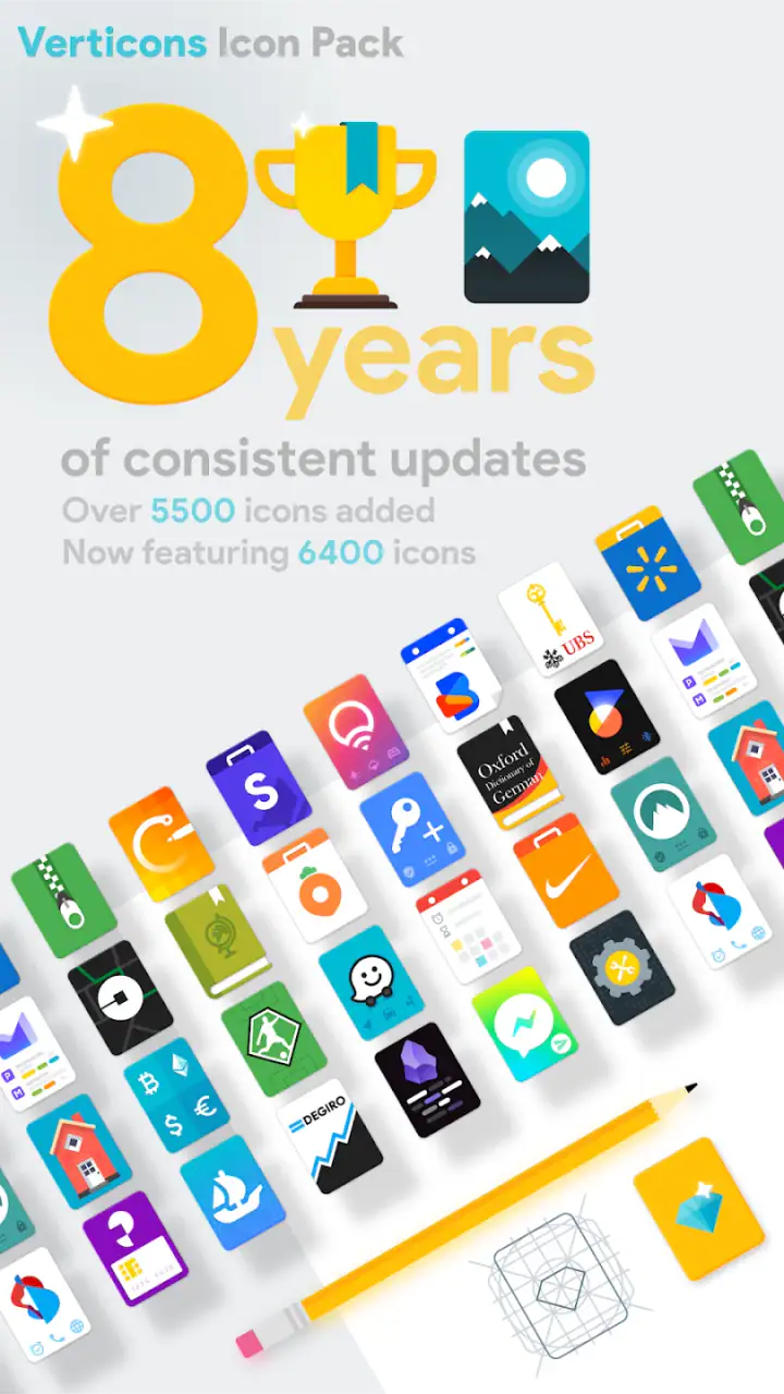
Compared with leaving the default icons in place, the advantage is obvious visual unity. Compared with a complete launcher makeover, the approach is more restrained and less disruptive. I can keep the familiar behavior of the phone while changing the part I see most often. That makes it a better fit for someone who wants a refreshed appearance but does not want to learn a new launcher.
Setting it up on a household device
Before installing it on a shared phone or tablet, I would first check which launcher is active and whether that launcher supports icon packs. This is a practical step that saves frustration. A person may pay for a design they like, only to discover that the current launcher offers no straightforward way to apply it.
Once the pack is available, I would apply it while the device owner is present. A home-screen change affects everyone who uses the device, and a design that looks elegant to one person may make another person’s favorite apps harder to spot. On a personal phone, that is a minor issue. On a shared tablet, it is a coordination question.
I also recommend taking a quick mental snapshot of the existing layout before applying the pack. Icon changes should not require a complete reorganization, but launchers can present customization screens differently. Knowing where the main apps, folders, and widgets were placed makes it easier to reverse the change if the household prefers the original arrangement.
The current version is 2.5.9 and the minimum Android requirement is Android 5.0. That gives the app a broad compatibility range for older Android hardware, although the actual experience still depends on the launcher and device interface. I would not assume that every manufacturer’s home screen offers the same controls simply because the operating system meets the minimum requirement.
Boundaries matter more than the artwork on a shared device
One useful way to think about an icon pack is that it changes presentation, not ownership. If a phone has separate user profiles, work areas, or accounts, the pack does not replace those boundaries. It should not be treated as a way to separate a child’s apps from an adult’s apps, or personal tools from work tools.
For a household, I would use the visual style alongside simple organizational habits: separate folders, clear labels, and a first page reserved for common apps. Verticons can make those groups look more coherent, but it cannot prevent someone from opening, moving, or rearranging an app. That limitation is important for parents, roommates, and anyone sharing a tablet.
There is also a subtle trade-off between consistency and immediate recognition. A familiar default icon may be easier for a new or occasional user to identify than a themed version. If a grandparent, guest, or young child uses the device only occasionally, I would introduce the new appearance gradually rather than changing every page without explanation.
Recognition, labels, and coordination
Vertical icons look distinctive, but shape alone should not become the only navigation cue. I prefer leaving labels visible at first, especially on a shared device. Once everyone knows the arrangement, labels can be reduced or removed if the launcher allows it, but doing so too early may create unnecessary confusion.
A practical household arrangement is to place the most frequently shared apps in one row or one folder and keep personal apps on separate pages. The icon pack then acts as a visual thread across the layout. It is easier to tell that the screen has been intentionally organized, even when the installed apps belong to different people.
Another useful trick is to avoid judging the pack from a single icon. The design works through repetition. One vertical icon may look unusual, but a full row of them creates the intended effect. I would apply the pack, review the busiest page, and then decide whether the style works with the device’s icon spacing. A sparse page may not show enough of the design to justify the change.
Coordination is also about timing. Applying a new icon style just before someone needs the device for school, travel, or work is poor practice. I would make the change when the main users are available, give them a minute to find their regular apps, and keep the old arrangement in mind in case the visual adjustment proves unpopular.
Age context and trust
The Everyone rating makes the app suitable for a broad audience from an age-classification perspective. In practical terms, that means the subject matter is not the concern here. The more relevant issue is how much customization responsibility is appropriate for the person using the device.
For a teenager or adult who enjoys personalizing Android, this is a low-friction way to make the phone feel more individual. For a younger child, I would treat it as a supervised appearance change rather than an independent setup project. The pack does not provide parental controls, screen-time rules, app restrictions, or monitoring. Those needs require separate tools and settings.
That distinction is easy to miss because a redesigned home screen can make a device feel more controlled. It is not controlled in a security sense. A child can still access whatever the device account and launcher already permit, and another household member can still change the layout unless the device has its own restrictions. The icon pack should therefore be chosen for appearance, not mistaken for a trust or safety feature.
There is a positive side to using it with children: a consistent visual layout can support a simple routine. If learning, communication, and entertainment apps are placed in clearly named folders, the vertical style can make the arrangement feel deliberate. But the organization comes from the adults or users who set up the device, not from the pack itself.
Where it stands against other personalization choices
The usual alternative is to keep the manufacturer’s icons and change only the wallpaper. That is faster and involves less compatibility checking, but it does not create the same unified shape. Another option is a full launcher with extensive theme controls. That can deliver deeper customization, yet it may also alter gestures, search behavior, app drawers, and the habits of everyone sharing the phone.
Verticons sits between those choices. It is more distinctive than a wallpaper change and less invasive than replacing the launcher. I see that as its strongest position. Someone who wants a complete interface redesign may find it too limited, while someone who wants a visible refresh without changing how Android behaves may appreciate the narrower focus.
The trade-off is that the result depends on the apps and launcher around it. A mixed screen with unsupported or manually added shortcuts may not look perfectly uniform. I would accept that if I liked the vertical shape, but perfectionists should know that an icon pack is rarely as seamless as a tightly controlled operating-system theme.
Cost, purchases, and the decision to keep it
The initial price is $0.90, and listed in-app purchases range from $0.99 to $9.99 per item. I would consider the base purchase inexpensive for a visual change I expect to keep, but I would still review the purchase screen carefully before confirming anything beyond the initial app cost. Personalization can become expensive when optional additions are treated as essential.
My advice is to test the pack on the pages you actually use rather than judging it from a promotional image. Look at the dock, folders, notification shortcuts, and any page with a widget. If the vertical proportions make the screen feel cramped, the price will not make the design more comfortable. If the repeated shapes make the device easier and more pleasant to navigate, the small upfront cost is easier to justify.
For a household, I would also decide who is paying and who is responsible for future changes. A shared device can accumulate customizations that nobody remembers installing. Keeping the setup simple makes it easier to maintain, especially when the device changes hands between family members or roommates.
Who should install it, and who should skip it
I would recommend Verticons to Android users who enjoy distinctive icon geometry, want a cleaner-looking home screen, and prefer changing appearance without abandoning their current launcher. It is particularly suitable for a personal phone or a shared tablet where a consistent visual system can make a busy collection of apps feel more orderly.
I would be more cautious if your launcher offers weak icon-pack support, if you rely heavily on default icon recognition, or if several people use the device but disagree about visual changes. It is also not the right choice for someone looking for parental controls, separate household accounts, privacy tools, or automated coordination. Those are different problems, and this app does not address them.
Users who want animated themes, extensive widget redesign, custom gestures, or a complete home-screen overhaul may be happier with a launcher-based solution. Verticons is deliberately more focused. Its appeal comes from the vertical shape and the consistency it brings, not from trying to become an entire customization platform.
My household verdict
After using it as a visual layer rather than expecting it to manage the device, I found the concept easy to appreciate. The vertical rounded-rectangle treatment gives Android a recognizable look, and the benefit grows as more icons appear together. It can make a shared home screen feel less accidental, provided the people using the device agree on the change.
The most important limitation is also the simplest: this app changes icons, not behavior or boundaries. It will not separate accounts, protect personal apps, supervise a child, or keep a roommate from rearranging the screen. For those needs, I would choose the appropriate Android settings or a dedicated tool and use this pack only as the visual finishing layer.
SpaceMan’s app is therefore a good recommendation for a narrow but common goal: making an Android interface more cohesive while preserving the familiar launcher experience. I would install it on a personal device without much hesitation, and on a household device after agreeing on the layout with the other users. If the vertical style matches your taste and your launcher supports it well, the modest cost is reasonable; if you need control rather than appearance, I would skip it and look elsewhere.
FAQs for Verticons Icon Pack
What is Verticons Icon Pack?
Verticons Icon Pack is a custom icon collection for Android devices that replaces standard app icons with tall, rounded, vertically oriented designs. Its distinctive style gives your home screen a cleaner and more consistent appearance, especially when combined with matching wallpapers and a compatible launcher. It is intended for users who want a modern alternative to conventional square or circular icon packs.
Which launchers are compatible with Verticons Icon Pack?
Verticons generally works with many popular Android launchers that support third-party icon packs, including launchers such as Nova Launcher, Lawnchair, Smart Launcher, Action Launcher, and similar alternatives. Compatibility can vary depending on the launcher and device software. Before downloading, check your launcher’s icon settings or the pack’s supported-launcher list to confirm that automatic application is available.
Does Verticons Icon Pack include icons for every application?
The pack contains a large selection of custom icons, but it may not include a dedicated design for every application installed on your phone. Less popular, newly released, or region-specific apps can be missing. When an icon is unavailable, the pack may offer an icon request option or allow you to manually apply a similar icon through a compatible launcher, helping maintain a consistent home-screen style.
Is Verticons Icon Pack free to use?
Availability and pricing may depend on the version distributed through the relevant app store. Some versions or promotions may be free, while the complete icon pack can require a one-time purchase. It is best to review the current store listing before installing, including any in-app purchase information. A compatible launcher may also have separate premium features or requirements.
Does Verticons Icon Pack change the appearance of the entire phone?
Verticons mainly changes supported application icons on the home screen and app drawer; it does not completely redesign Android’s interface. Menus, notifications, settings, and system icons normally retain the appearance provided by your device or launcher. For a more complete visual transformation, you can combine the icon pack with a compatible wallpaper, widget setup, and launcher theme that matches its vertical design.
Pros
- Distinctive vertical icon design gives home screens a fresh appearance.
- Includes many themed wallpapers to match the icon style.
- Frequent updates may add support for newly released apps.
- Works with several popular Android launchers.
- Easy-to-use dashboard simplifies applying icons and wallpapers.
Cons
- Some less popular apps may lack a dedicated custom icon.
- Requires a compatible launcher and is not designed for iOS.
- The unusual shape may not suit users who prefer standard icons.
- Premium features may be needed for the complete experience.
- Icon masking for unsupported apps can look less polished than themed ones.


